In-Hospital Navigation II
In-Hospital Navigation II
Part 3 of 3 Projects
Created by: Elyssa Chung
3 STEPS
Before reading on :
Continuing on the theme of inclusion and diversity, this project is the third half of this semester's synthesis project. That said, during the completion of this project the quarantine and lockdown continue to persist. Thus, classes and the entire design process continued to be held online. So yea, overall I’m continuing to tackle this design problem by myself armed with the power of the internet.
With this project in particular, it’s an amalgamation of the two projects that I have done earlier in the year. That said, this design intervention is going to go back to focusing on the issue of in-hospital navigation for those with visual impairments.
SUMMARY
Duration: Apr 6- Apr 15
Team: Just me
Role(s) played:
- Ux researcher, - Interaction designer, - Product designer, - Project manager
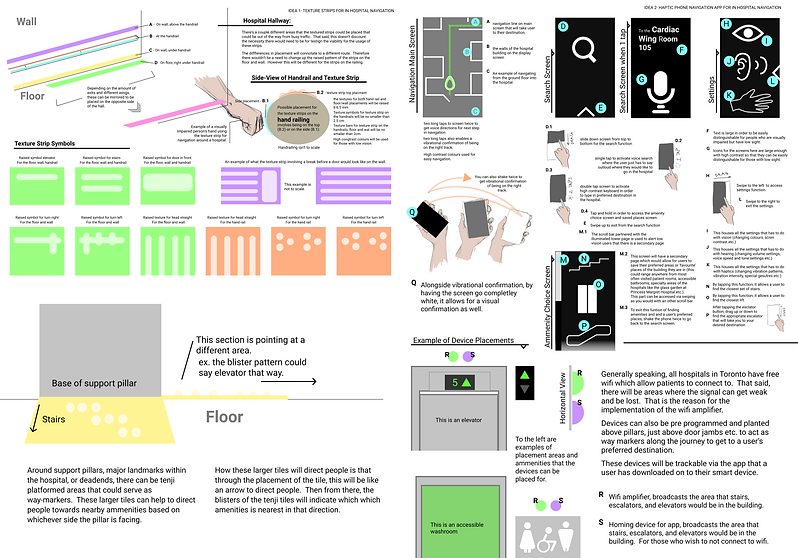
FOR THE SOLUTION WITH TEXTURE STRIPS
From Project 2 for TTC Navigation:
Took the idea of placing large floor signs (like gigantic Tenji tiles) with iconography made from the circular blisters in order to point users in the direction of amenities (like toilets, elevators etc.). The signs will also be placed on the floor around pillars and major landmarks.
From Project 1 for In-Hospital Navigation:
Took the entire idea
with the texture strips.
FOR THE SOLUTION WITH THE APP
From Project 2 for TTC Navigation:
Added in options for homing signals so if users are unable to connect to wifi, they will be able to track down where various amenities (elevators, washrooms etc.) are.
Also added in the screen that would allow users to choose which amenities they're searching for.
From Project 1 for In-Hospital Navigation:
The base gestures and
original app design
were used.

R=wifi amplifier
S=homing device

Continue to In-Hospital Navigation


Overall, when working on this project, if there’s one thing that I’ve realized, it's that through all the projects that contributed to the design process, I’ve always taken to creating a solution that’s double-pronged. Thinking about it now, I guess the lesson that’s really being honed is that when designing for diversity and inclusion, there’s nothing wrong with designing multiple solutions towards the same goal in order to accommodate different stakeholders. In the end, it’s unrealistic to design a one size fits all solution. And better to have multiple solutions that can be tailorable to each user’s specific needs rather than driving one’s self mad with aiming to get that magical solve-all.
CONCLUSION
As for the bit with not being able to tell what direction escalators are going, with the app, user’s can select the option for escalators followed by which direction they’re looking for. Thus from there, the app would then lead the user to the appropriate escalator
ISSUES FACED
For the most part, my solution could be implemented anywhere. Although, when looking back to the start of my first project, I realized that there were aspects that were lacking. Here are some examples of some of the issues I realized:
-
Amenities such as elevators, escalators, washrooms are difficult to find. People usually rely on either asking others for directions or guessing based off of the audio feedback of crowds from their surroundings. Stairs are dangerous if going with low sight. So ideally, elevators are best.
-
That said, escalators are also an option, though if having low to now sight, people can’t usually tell what direction escalators are going, unless reaching out to feel what directions the handrails are going. And that in itself is dangerous as well since there will be a crowd of impatient people waiting to get to their next destination. And escalators are basically moving machinery. There’s even warning signs for people with sight to remind people to not let themselves get stuff accidentally caught in the machinery
USING ONE SOLUTION TO PATCH THE OTHER
Thus, in order to solve these issues, I basically used aspects from my TTC station navigation solution to patch holes in my first design for in-hospital navigation

With the issue of finding ammenities:
Long story short, there will be homing devices that will be linked to be picked up by the app. With these homing devices, they will allow for quick and easy access to locating amenities such as elevators, escalators and washrooms without needing to hop onto the wifi.

THERE ARE ISSUES WITH NO CLEAR SOLUTION
However, it was realized that there were a couple issues with the design that holds possibilities of unwittingly excluding a population This issue couldn’t be solved as easily.
It was considered that while imagery could be placed overtop the floor braille sign boards around pillars and major landmarks in the hospital, that same imagery might not be implementable since due to the lack of space, it wouldn’t allow people to easily spot what the signs say, thus not making the design choice practical. Additionally if putting in the imagery for those who are sighted, it might make it more difficult for people who are visually impaired to be able to tell the path (since the strips are designed to also be high colour contrast. So adding extra imagery, would make it needlessly complicated and have the possibility of adding to the user’s mental workload.